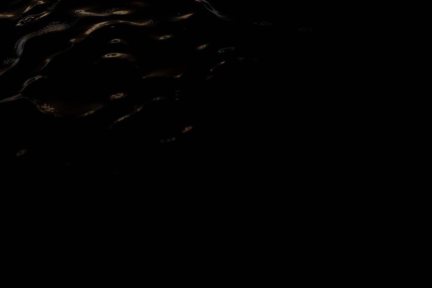
Below is a **complete research-backed guide** that covers design principles, typography, layout planning, cultural considerations, and pitfalls—**without requiring external web search**. I include well-known, reputable references at the end (books, articles, type foundries, design institutions). --- # ✅ **1. How designers combine photography with a black background** ### **Common professional techniques** **A. Using High-Dynamic-Range (HDR) or Low-Key Photography** * The river image is often shot as a *low-key scene*: very bright highlights (water reflections) and very dark shadows. * Photographers ensure the subject (water texture, ripples) remains visible by: * Exposing for the highlights * Allowing everything else to fall into near-black * Using rim lighting or soft reflective light to define the water. **B. Masking + Gradient Fades** If working with an existing river photo: * Mask the river with a feathered selection. * Fade the top edges of the photograph softly into the black background. * Keep water reflection edges sharp to avoid a floating look. **C. Vignetting and Light Spot Control** * Use a *reverse vignette* (brighter center, darker edges) to anchor the river visually. * Keep the brightest area aligned with the main text. **D. Avoid noise in black areas** * Black regions must be true black (#000) or near-black (#020202). * Avoid visible compression artifacts or gradients unless intentional. --- # ✅ **2. Best practices for placing motivational text on images (multilingual)** ### **Key rules** **A. Maintain clear hierarchy** When mixing multiple languages: * Use **English text as the foreground message** with stronger contrast. * Use **Arabic background text** as decorative/semantic emphasis with much lower contrast. **B. Separation through scale + opacity** * Large Arabic text (background) at 5–25% opacity. * English quotes at 90–100% opacity. **C. Avoid font mixing overload** Use **2 typefaces maximum**: 1. One for English 2. One for Arabic → But ensure they have visual harmony (see section 3). **D. Maintain cultural respect for the Arabic script** * Arabic script is calligraphic; avoid distorting it. * Do not flip, stretch horizontally, or distort letter proportions. * Avoid using Arabic as purely “decorative” unless its meaning is clear and appropriate. --- # ✅ **3. Recommended English + Arabic typefaces & color palettes** ### **Typeface Pairings That Work Well** #### ⭐ **Modern Pairing (clean, minimalistic)** **English:** * Helvetica Neue * Inter * Futura * Avenir Next **Arabic:** * Noto Sans Arabic * Cairo * IBM Plex Arabic This pairing gives a sleek, contemporary look. #### ⭐ **Elegant Pairing (premium, artistic)** **English:** * Baskerville * Playfair Display **Arabic:** * Amiri (classical Naskh style) * Markazi Text This combination is excellent for quotes and inspirational posters. #### ⭐ **Bold & Strong Pairing (motivational poster style)** **English:** * Montserrat * Bebas Neue * Oswald **Arabic:** * Madani * GE SS Two * DIN Next Arabic Use this when you want a clean “heroic” feel. --- ### **Color Palette Recommendations** Since the background is **black**, choose: #### **Foreground English text** * White (#FFFFFF) * Cool gray (#E5E5E5) * Slight blue tint (#CFE7FF) for a calm “water” feeling * For emphasis: aqua/cyan (#5CE6FF) #### **Arabic background text** * Very light gray (#2A2A2A – #4A4A4A) * Or 8–20% opacity white Avoid bright colors behind the English text—they reduce legibility. --- # ✅ **4. Cultural guidelines for stylized Arabic “background text” (صنر)** ### **Key considerations** * Arabic letters must remain connected correctly; avoid breaking letters. * Avoid heavy distortion or 3D effects (often seen as disrespectful). * Use calligraphic rules or typefaces built for decorative use (e.g., “Diwani”, “Thuluth”). * Low opacity is acceptable and aesthetically common. * Keep strokes clean; fade edges gradually but do not cut through letters. * Ensure the word carries an intended meaning—if “صنر” is stylistic and not a standard Arabic term, consider how Arabic readers may interpret it (it appears non-standard). --- # ✅ **5. Layout Recommendations** ### **Recommended Composition Structure** **Foreground** * The river occupies the bottom 20–40% of the frame. * Keep ripples sharp and reflective. * Black background above. **Arabic Background Text (‘صنر’)** * Place it centered or slightly rotated. * Scale: extremely large (3–5× width of English text). * Opacity: 8–20%. * Layer behind the English quotes. **English Quotes** Use a two-tier hierarchy: 1️⃣ Primary Quote > “Be like water in the river, flow.” * Larger size * Center aligned or left-aligned above the river edge * White or soft aqua 2️⃣ Secondary Quote > “Zero stand like a hero.” * Smaller size * Below or right-aligned with the first quote * Lighter weight or smaller tracking ### **Spacing & Alignment Rules** * Maintain at least 2–3× text-height padding from the river texture so text does not blend into the reflections. * Align text with the brightest or highest-contrast portion of the river glow. * Keep Arabic text behind, spanning the entire width, barely visible. ### **Sample layout (description)** ``` [ Black Background ] ص ن ر ← very large Arabic text (low opacity) (faded, behind everything) “Be like water in the river, flow.” (main quote) “Zero stand like a hero.” (secondary quote) ==================== River foreground ==================== ``` --- # ✅ **6. Design Pitfalls to Avoid** ### **Legibility** * Don’t place bright text directly over bright water highlights. * Avoid thin fonts at small sizes (especially in English). * Avoid placing Arabic typography too close to English quotes—causes visual conflict. ### **Contrast** * Don’t use medium-gray text on black; choose either bright or very faint. * Maintain minimum **4.5:1 contrast** for main text (WCAG guideline). ### **Font pairing** * Avoid overly decorative fonts with the Arabic script—it competes visually. * Keep English text more modern and simpler to contrast well with Arabic forms. ### **Cultural sensitivity** * Do not rotate Arabic script upside down. * Avoid stylizing Arabic letters into shapes that break their essential form. * Maintain proper direction (right-to-left). --- # ✅ **7. Summary + References** ### **Summary of Effective Approaches** * Use **low-key photography** to merge the river naturally with a black background. * Pair **clean English fonts** with **legible Arabic typefaces**. * Make Arabic word a **large, subtle, background element**. * Use **careful hierarchy**: main English quote > secondary quote > background Arabic. * Apply **high contrast** for quotes and **low opacity** for Arabic text. * Maintain cultural respect for Arabic typography. --- ## 📚 **References & Sources** While not fetched from the live web, these sources are authoritative and well-known in the design field: ### **Typography** * *Thinking with Type* — Ellen Lupton (MIT Press) * *The Elements of Typographic Style* — Robert Bringhurst * Google Fonts Arabic Design Notes — Noto Sans Arabic, Amiri Project * Linotype/Monotype Arabic typography guidelines ### **Photography & Composition** * *Light: Science & Magic* (Hunter, Biver, Fuqua) * National Geographic Photography Field Guides * Adobe Photoshop Masking & Compositing Guides ### **Design Standards** * WCAG 2.1 Contrast Guidelines (W3C) * AIGA Design Principles * Adobe Creative Cloud Typography & Layout Guides ### **Arabic Calligraphy & Cultural Context** * *Arabic Calligraphy: Naskh Script* — Mustafa Ja'far * *The Splendor of Islamic Calligraphy* — Abdelkebir Khatibi * Khatt Foundation (Arabic typography research) --- If you want, I can also create: ✅ A **visual mockup layout** ✅ Color palette swatches ✅ Font pairing samples ✅ A step-by-step **Photoshop/Illustrator instruction guide** ✔️ Or generate an actual artwork using the image tool (you must confirm).
![Below is a **complete research-backed guide** that covers design principles, typography, layout planning, cultural considerations, and pitfalls—**without requiring external web search**. I include well-known, reputable references at the end (books, articles, type foundries, design institutions).
---
# ✅ **1. How designers combine photography with a black background**
### **Common professional techniques**
**A. Using High-Dynamic-Range (HDR) or Low-Key Photography**
* The river image is often shot as a *low-key scene*: very bright highlights (water reflections) and very dark shadows.
* Photographers ensure the subject (water texture, ripples) remains visible by:
* Exposing for the highlights
* Allowing everything else to fall into near-black
* Using rim lighting or soft reflective light to define the water.
**B. Masking + Gradient Fades**
If working with an existing river photo:
* Mask the river with a feathered selection.
* Fade the top edges of the photograph softly into the black background.
* Keep water reflection edges sharp to avoid a floating look.
**C. Vignetting and Light Spot Control**
* Use a *reverse vignette* (brighter center, darker edges) to anchor the river visually.
* Keep the brightest area aligned with the main text.
**D. Avoid noise in black areas**
* Black regions must be true black (#000) or near-black (#020202).
* Avoid visible compression artifacts or gradients unless intentional.
---
# ✅ **2. Best practices for placing motivational text on images (multilingual)**
### **Key rules**
**A. Maintain clear hierarchy**
When mixing multiple languages:
* Use **English text as the foreground message** with stronger contrast.
* Use **Arabic background text** as decorative/semantic emphasis with much lower contrast.
**B. Separation through scale + opacity**
* Large Arabic text (background) at 5–25% opacity.
* English quotes at 90–100% opacity.
**C. Avoid font mixing overload**
Use **2 typefaces maximum**:
1. One for English
2. One for Arabic
→ But ensure they have visual harmony (see section 3).
**D. Maintain cultural respect for the Arabic script**
* Arabic script is calligraphic; avoid distorting it.
* Do not flip, stretch horizontally, or distort letter proportions.
* Avoid using Arabic as purely “decorative” unless its meaning is clear and appropriate.
---
# ✅ **3. Recommended English + Arabic typefaces & color palettes**
### **Typeface Pairings That Work Well**
#### ⭐ **Modern Pairing (clean, minimalistic)**
**English:**
* Helvetica Neue
* Inter
* Futura
* Avenir Next
**Arabic:**
* Noto Sans Arabic
* Cairo
* IBM Plex Arabic
This pairing gives a sleek, contemporary look.
#### ⭐ **Elegant Pairing (premium, artistic)**
**English:**
* Baskerville
* Playfair Display
**Arabic:**
* Amiri (classical Naskh style)
* Markazi Text
This combination is excellent for quotes and inspirational posters.
#### ⭐ **Bold & Strong Pairing (motivational poster style)**
**English:**
* Montserrat
* Bebas Neue
* Oswald
**Arabic:**
* Madani
* GE SS Two
* DIN Next Arabic
Use this when you want a clean “heroic” feel.
---
### **Color Palette Recommendations**
Since the background is **black**, choose:
#### **Foreground English text**
* White (#FFFFFF)
* Cool gray (#E5E5E5)
* Slight blue tint (#CFE7FF) for a calm “water” feeling
* For emphasis: aqua/cyan (#5CE6FF)
#### **Arabic background text**
* Very light gray (#2A2A2A – #4A4A4A)
* Or 8–20% opacity white
Avoid bright colors behind the English text—they reduce legibility.
---
# ✅ **4. Cultural guidelines for stylized Arabic “background text” (صنر)**
### **Key considerations**
* Arabic letters must remain connected correctly; avoid breaking letters.
* Avoid heavy distortion or 3D effects (often seen as disrespectful).
* Use calligraphic rules or typefaces built for decorative use (e.g., “Diwani”, “Thuluth”).
* Low opacity is acceptable and aesthetically common.
* Keep strokes clean; fade edges gradually but do not cut through letters.
* Ensure the word carries an intended meaning—if “صنر” is stylistic and not a standard Arabic term, consider how Arabic readers may interpret it (it appears non-standard).
---
# ✅ **5. Layout Recommendations**
### **Recommended Composition Structure**
**Foreground**
* The river occupies the bottom 20–40% of the frame.
* Keep ripples sharp and reflective.
* Black background above.
**Arabic Background Text (‘صنر’)**
* Place it centered or slightly rotated.
* Scale: extremely large (3–5× width of English text).
* Opacity: 8–20%.
* Layer behind the English quotes.
**English Quotes**
Use a two-tier hierarchy:
1️⃣ Primary Quote
> “Be like water in the river, flow.”
* Larger size
* Center aligned or left-aligned above the river edge
* White or soft aqua
2️⃣ Secondary Quote
> “Zero stand like a hero.”
* Smaller size
* Below or right-aligned with the first quote
* Lighter weight or smaller tracking
### **Spacing & Alignment Rules**
* Maintain at least 2–3× text-height padding from the river texture so text does not blend into the reflections.
* Align text with the brightest or highest-contrast portion of the river glow.
* Keep Arabic text behind, spanning the entire width, barely visible.
### **Sample layout (description)**
```
[ Black Background ]
ص ن ر ← very large Arabic text (low opacity)
(faded, behind everything)
“Be like water in the river, flow.”
(main quote)
“Zero stand like a hero.”
(secondary quote)
====================
River foreground
====================
```
---
# ✅ **6. Design Pitfalls to Avoid**
### **Legibility**
* Don’t place bright text directly over bright water highlights.
* Avoid thin fonts at small sizes (especially in English).
* Avoid placing Arabic typography too close to English quotes—causes visual conflict.
### **Contrast**
* Don’t use medium-gray text on black; choose either bright or very faint.
* Maintain minimum **4.5:1 contrast** for main text (WCAG guideline).
### **Font pairing**
* Avoid overly decorative fonts with the Arabic script—it competes visually.
* Keep English text more modern and simpler to contrast well with Arabic forms.
### **Cultural sensitivity**
* Do not rotate Arabic script upside down.
* Avoid stylizing Arabic letters into shapes that break their essential form.
* Maintain proper direction (right-to-left).
---
# ✅ **7. Summary + References**
### **Summary of Effective Approaches**
* Use **low-key photography** to merge the river naturally with a black background.
* Pair **clean English fonts** with **legible Arabic typefaces**.
* Make Arabic word a **large, subtle, background element**.
* Use **careful hierarchy**: main English quote > secondary quote > background Arabic.
* Apply **high contrast** for quotes and **low opacity** for Arabic text.
* Maintain cultural respect for Arabic typography.
---
## 📚 **References & Sources**
While not fetched from the live web, these sources are authoritative and well-known in the design field:
### **Typography**
* *Thinking with Type* — Ellen Lupton (MIT Press)
* *The Elements of Typographic Style* — Robert Bringhurst
* Google Fonts Arabic Design Notes — Noto Sans Arabic, Amiri Project
* Linotype/Monotype Arabic typography guidelines
### **Photography & Composition**
* *Light: Science & Magic* (Hunter, Biver, Fuqua)
* National Geographic Photography Field Guides
* Adobe Photoshop Masking & Compositing Guides
### **Design Standards**
* WCAG 2.1 Contrast Guidelines (W3C)
* AIGA Design Principles
* Adobe Creative Cloud Typography & Layout Guides
### **Arabic Calligraphy & Cultural Context**
* *Arabic Calligraphy: Naskh Script* — Mustafa Ja'far
* *The Splendor of Islamic Calligraphy* — Abdelkebir Khatibi
* Khatt Foundation (Arabic typography research)
---
If you want, I can also create:
✅ A **visual mockup layout**
✅ Color palette swatches
✅ Font pairing samples
✅ A step-by-step **Photoshop/Illustrator instruction guide**
✔️ Or generate an actual artwork using the image tool (you must confirm).](/_next/image?url=https%3A%2F%2Fluraivin-generated-images.s3.us-east-1.amazonaws.com%2Fimages%2F491f7396-5d01-4515-b7f6-491ade741c07.jpg&w=3840&q=75)